Configuration depth
Organise many customisation choices without making the product page feel like a technical form.

Case study / Shopify ecommerce
A custom Shopify implementation that organises sash styles, colours, fabrics and personalisation into a clearer product-selection and checkout experience.
01 / The brief
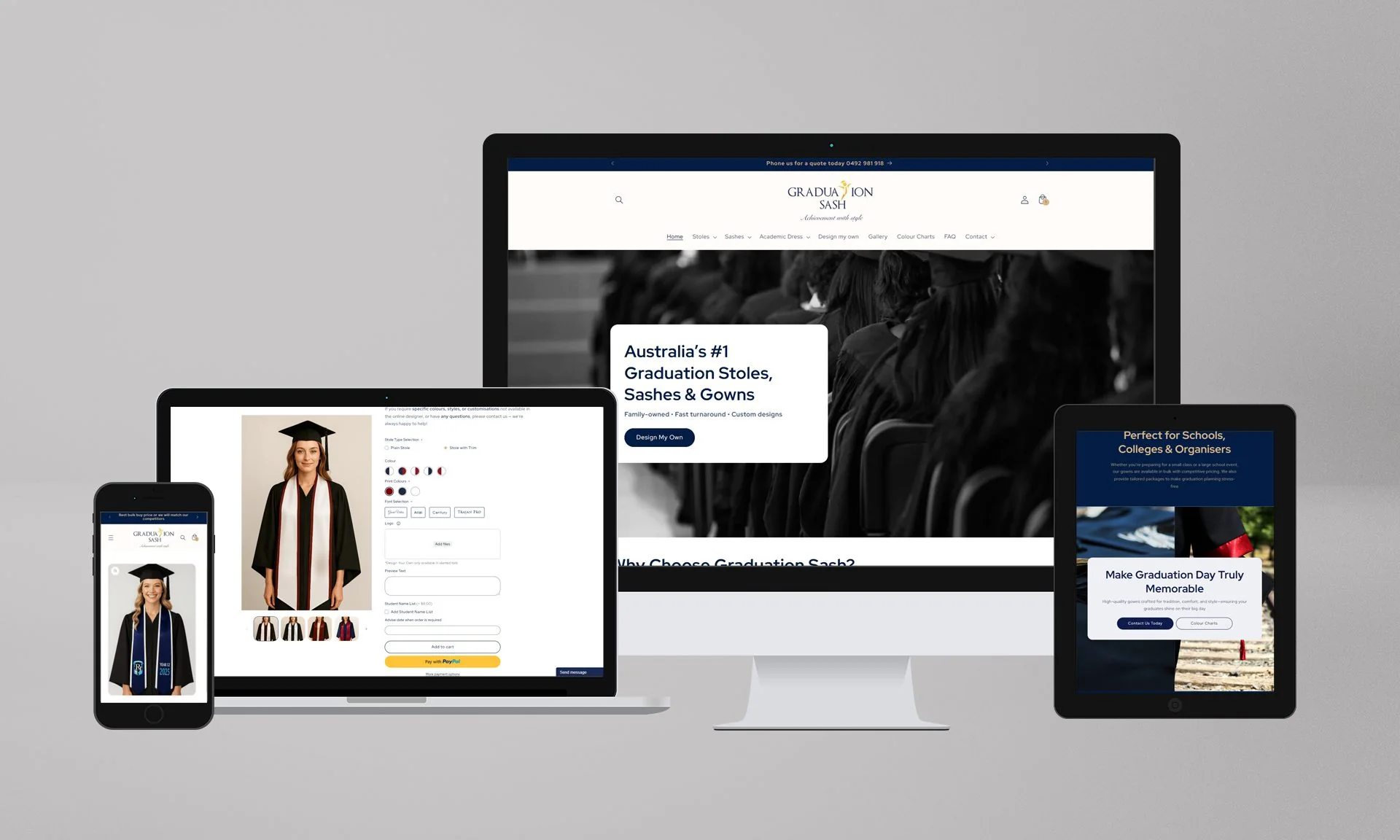
Graduation Sash Australia supplies personalised graduation sashes for schools, universities and events. The documented project involved redesigning and enhancing its Shopify storefront for a product catalogue with substantial configuration requirements.
Prysma DMKT partnered with DMKT Performance to improve the customer journey, responsive presentation, asset consistency, backend flexibility and SEO foundations.
02 / The challenge
Sash orders can include fabric, colour, text, typography, icons and placement choices. The original store had accumulated front-end complexity and heavy imagery, making both customer configuration and backend maintenance harder.
The redesign needed to reduce cognitive load while preserving the flexibility that makes the product valuable.
Organise many customisation choices without making the product page feel like a technical form.
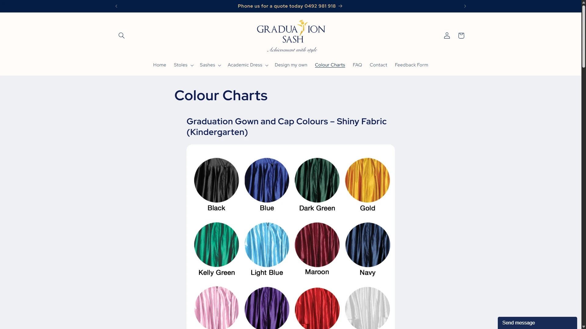
Standardise colour charts and product assets so options can be compared with greater confidence.
Give the store team reusable sections and product structures for seasonal campaigns and updates.
03 / The experience

The storefront treats configuration as a sequence of understandable decisions rather than a single dense block.
Start from the appropriate sash or stole format before introducing detailed options.
Present colour, fabric, text, font, icon and placement choices in a structured configuration flow.
Carry order context into a mobile-friendly purchase path without forcing users to reconstruct their selections.
04 / The implementation
The implementation used Shopify Online Store 2.0 concepts, custom Liquid and reusable sections to give the storefront more control without relying on a rigid page layout.
The scope also included product templates, colour-chart presentation, mobile behaviour, image optimisation and SEO foundations intended to support discovery across Australia.
05 / Evidence
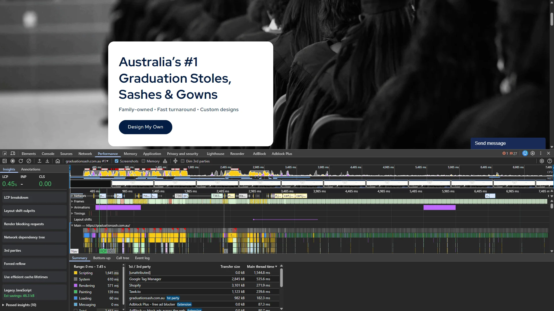
For a configurable product, evidence should demonstrate how choices are presented and how the customer progresses through them.
06 / Results & delivery
The project delivered a more structured Shopify experience for product personalisation, reusable merchandising and mobile ordering. It also reduced dependence on one-off front-end edits for future product and campaign changes.
The original case describes speed and checkout improvements qualitatively but does not retain a numeric analytics dataset suitable for verified conversion claims.
Key takeaway
Complex ecommerce does not always require more interface. The strongest configuration flows expose choices in the order customers need them, preserve context between steps and keep the underlying product system manageable for the team operating the store.
Share the current website, the constraint and what needs to change.