Clarify services
Create understandable pathways into psychology services without forcing users through generic overview pages.

Case study / Healthcare website
A WordPress redesign structured around services, practitioners and appointment intent, helping prospective patients move through information with less friction.
01 / The brief
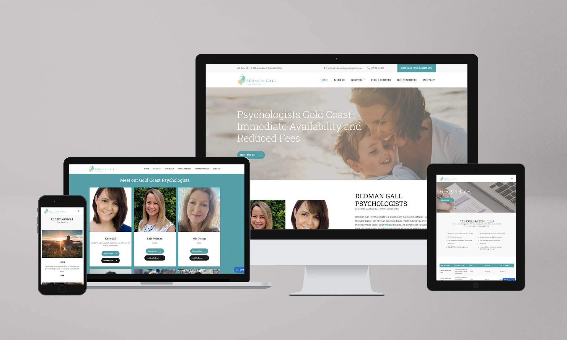
Redman Gall Psychologists is an Australian psychology practice. The documented redesign focused on improving usability, trust, service discovery and the path from initial research to contact or booking.
Prysma DMKT worked with DMKT Performance on a WordPress implementation that brings service pages, practitioner profiles, FAQs and calls to action into a more consistent system.
02 / The challenge
A prospective patient may enter through a specific service, a practitioner name or a general search for support. The site needed to accommodate those different entry points without making the information architecture feel clinical or complicated.
Trust content also needed to appear naturally within the journey so users could evaluate the practice before taking the next step.
Create understandable pathways into psychology services without forcing users through generic overview pages.
Give team profiles a functional role in helping visitors evaluate fit and experience.
Keep contact and booking actions available after relevant information rather than separating them from the patient journey.
03 / The experience
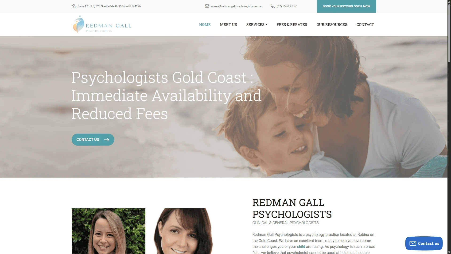
The experience connects service understanding, practitioner context and appointment intent in sequence.
Use clear headings and concise content to explain the relevant area of support.
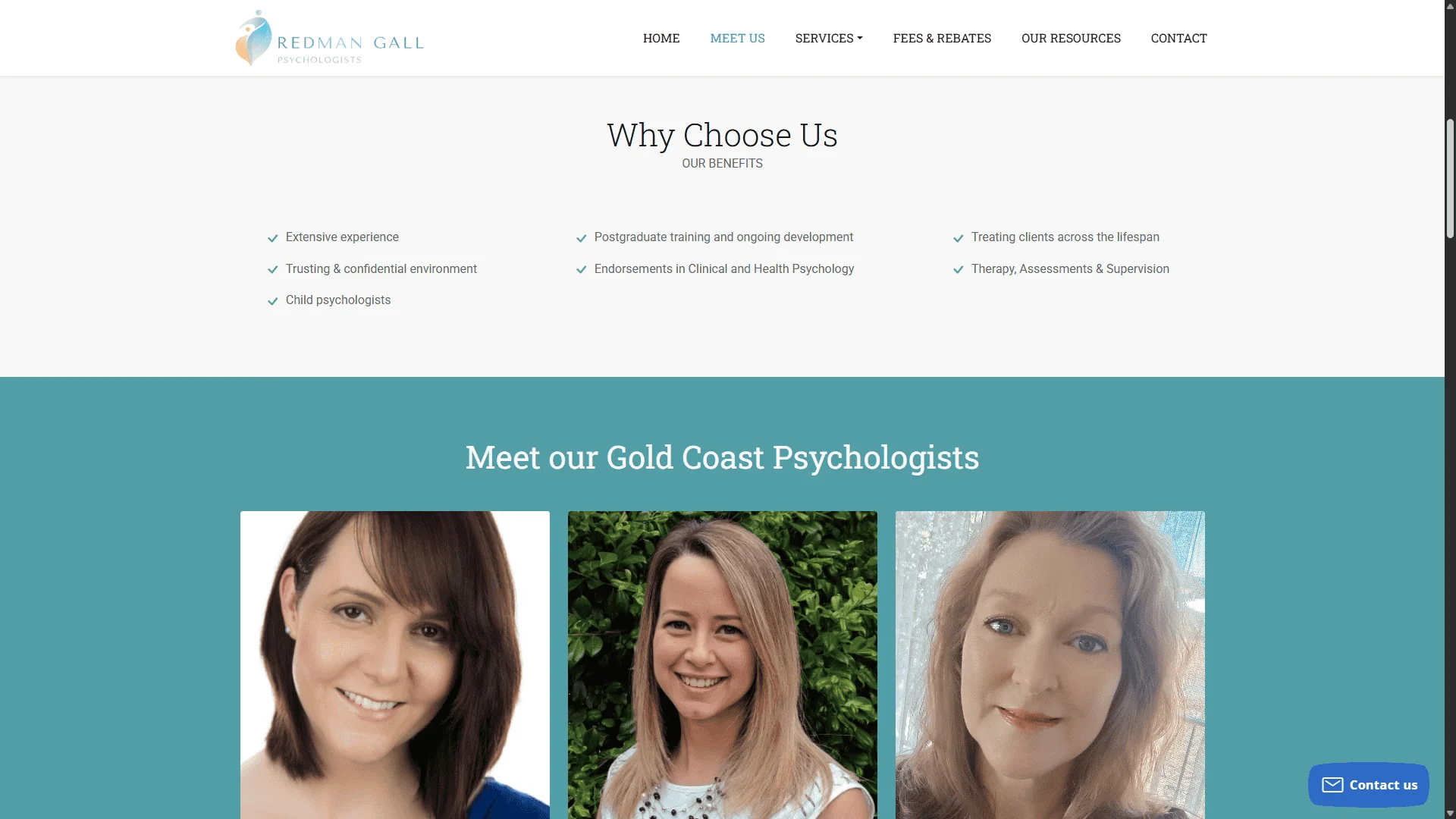
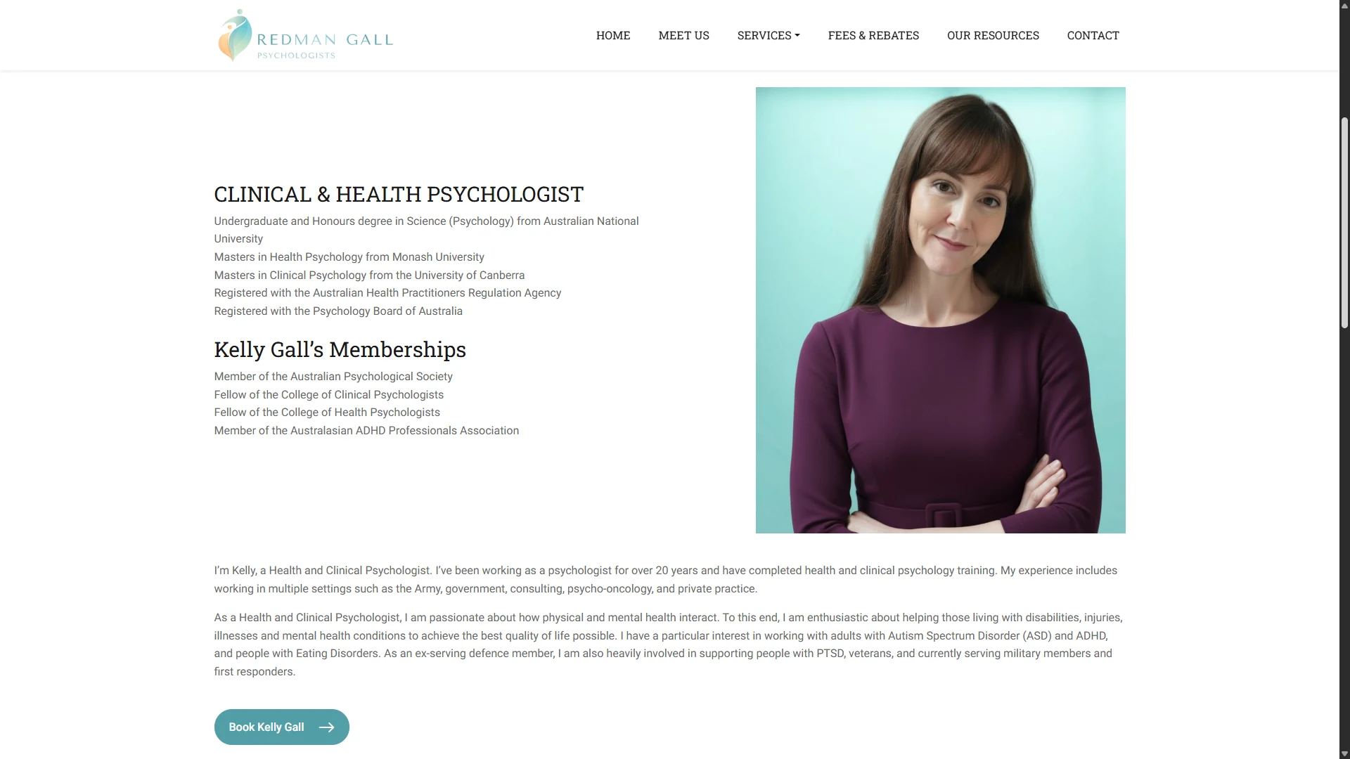
Provide team profiles and practice context so visitors can assess fit before contacting the clinic.
Place booking and contact actions at moments where the visitor has enough context to proceed.
The recording browses the team directory and opens a professional profile with appointment links. It shows the path to those links, without completing an appointment or displaying patient records.
04 / The implementation
The documented development used WordPress, Bootstrap 5 and custom patterns for hero sections, service cards, testimonials, FAQs and calls to action.
Dedicated service pages, practitioner profiles and contact/booking pathways were combined with on-page SEO work so the website could support both direct navigation and local search entry points.
05 / Evidence
Supporting screenshots show how service information and broader practice context are distributed across the experience.
06 / Results & delivery
The redesign delivered a reusable website system for services, practitioners, trust content and appointments, reducing the need for each page to solve the same UX problem differently.
The original project reports improvements in visibility and engagement but does not preserve a detailed measurement dataset. For that reason, this case does not convert those statements into invented percentage results.
Key takeaway
Healthcare websites benefit from reducing uncertainty one decision at a time. Service information, practitioner context and appointment actions should be connected so the user never has to restart their journey when moving from research to contact.
Share the current website, the constraint and what needs to change.